These were the steps taken to make this particular brewery label.
First we start with the sketch, and there were lots of ideas going back and forth. General guidelines and feelings, but for the most part the client was receptive to new ideas and was willing to leave a lot of the creative elements up to me. I enjoyed this project quite a bit, mostly because of the people I was working with.
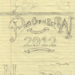 First we started with sketch work the client had done previously, ideas he had, thoughts on the topic. I asked him what his goals were, what kind of feelings he wanted to evoke. Asked him what styles he liked, showed him a few varied examples to get an idea. Fortunately, his ideas were mostly simple, elegant, and clean designs. I enjoyed that.
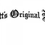 Essentially, this was my feeler image. I wanted to see if he would like this at all and see if he’s okay with the direction before I proceeded any further. His feedback was as expected, he liked it but it felt bare and missing something (truth be told, it’s missing a LOT). You can see the beginnings of a ligature, but I threw this together after only a few minutes to see what he was into. When he gave me the go ahead to continue in this direction, that’s when I started the real work.
As we can see here:
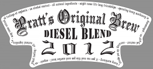
And then we went through a few revisions, some mine, some his, and settled on the final:
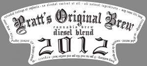
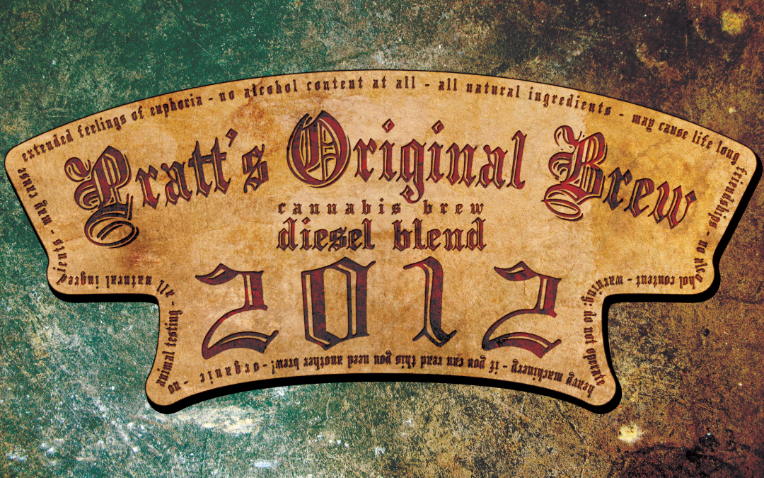
and a textured sample for an actual label (Also seen as featured image):

Hope you like it!

the logo looks great on the product 😉
Thanks! Taj needs to get a higher quality printer to get the details to come out better.